Tuesday, 20 March 2018

Opening Sequence Analysis: Baby Driver


The second film opening sequence I have decided to analyse is Baby Driver. It's very different to typical films as Edgar Wright created a film where the sound has been synchronised with the camera shots to give it a cinematic feel. The film follows the two different lifestyles lead by Baby, whose hearing is partially impaired because of a car accident he was involved in when he was younger. He works as a getaway driver for his boss, Doc, and he is also portrayed as a caring regular guy who looks after Joseph, his deaf foster parent. But just as he thinks he's finished and can have his life back Doc gives him one more job with violently unstable criminals which put him and Debora, his love interest, in danger.

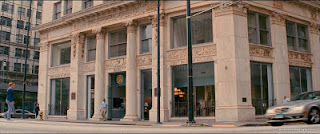
The film begins with a wide shot from a low angle of a regular street only using muted cool tones to emphasise the bright red car which pulls up in front of the camera forcing a close up shot of the wheel. Already the main characters are easy to distinguish from each other with their colour coordinated outfits which become clearer later on. The  film introduces each character one by one with the beat of the music Baby plays into his earphones. This is followed by a series of pan shots as the three walk into the bank wearing sunglasses and bandanas to hide their identities. As they disappear into the bank the camera cuts to Baby dancing and singing to his upbeat music which suggests he is just a kid and emphasises the contrast between him and the professional criminals suggesting that he doesn't belong in the group.
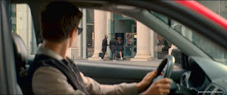

This cheerful atmosphere quickly comes to an end when a police car rides past with its sirens on and the music fades out. We then see Baby's point of view as he looks at the chaos inside the ban. The music in the background is suppressed by the screams within the bank showing Baby has lost focus on the music. As a shot gets fired the music returns to it's normal upbeat rhythm and Baby twitches as though he feels uncomfortable further emphasising that he's not used to violence and doesn't belong with the criminals.
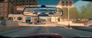
After robbing the bank this quickly turns into a chase scene where Baby shows off his unusually good driving skills. The music is accompanied by the sounds of the car engines and police sirens. This continues the well edited sound which make it pleasing for the audience to watch. The chase scene continues for about three minutes before the titles sequence starts.

In comparison, this opening sequence grabs the viewers’ attention from the beginning whereas Hidden Figures is more relaxed and introduces character Katherine Johnson using a series of flashbacks into her school life. Baby Driver uses many cuts of actions scenes and as Hidden Figures is a historical drama the shots are longer.


Screenshots from: http://moviescreenshots.blogspot.com/2018/03/baby-driver-2017-part-1.html

Monday, 19 March 2018

Opening Sequence Analysis: Hidden Figures


As part of my research, I am going to analyse the opening sequence to Hidden Figures and Baby Driver. The beginning of a film is very important, as it has to be entertaining for the viewer to be interested and want to watch it further. The colour palette, mise-en-scene, shot types, etc. all play a part in making the film interesting to watch. Hopefully, this analysis will give me a couple ideas of what to do for my own opening sequence.
Hidden Figures is a historical drama based on true events on the launch of astronaut John Glenn into orbit. The film follows the lives of three African-American women Katherine Johnson, Dorothy Vaughn and Mary Jackson working for NASA. This film uses Todorov’s narrative theory which create an interesting structure. The film consists of various ups and downs these female mathematicians faced, such as the gender and racial divide that existed in society back then.

Hidden figures begins with a flashback to when Katherine was a young girl. The producer has done this to give the audience some context to be able to understand the scenes that follow. Katherine was given a place at a higher education and got taken on early due to her incredible potential. This introduction to the protagonist’s childhood is shown in a slight sepia tone suggesting it is in the past. The producer conforms to the geek stereotype as Katherine wears glasses however, he breaks stereotypes by having three African-American female protagonists.

The hue changes to the current time of 1961 with a pan into an establishing shot. The sepia tone fades and we see a broken down car. The characters are set up almost immediately with the wide camera shot showing Dorothy trying to fix the car, Katherine daydreaming and Mary standing on the other side of the screen irritated by the situation. Suddenly, a police car is seen in the distance. The three women seem nervous signifying they don’t belong there setting the tone for the civil rights movement and what black women endured at the time. As the white male police officer walks up to the three women a close up shot shows his hand on the baton suggesting he’s quick to judge and does not trust them. However, when he finds out they work for NASA he quickly becomes friendly representing the importance of the space race to the entire country. This leads to the police officer offering them an escort to NASA.


In conclusion, the use of a flashback at the beginning fills in the audience on important information without distracting from the current time and helps get to the point quicker. The different colour palettes help indicate the different time zones effectively. I will now compare this opening sequence to Baby Driver which will hopefully give me some ideas of what to do for my production.
Screenshots from http://moviescreenshots.blogspot.com/2018/01/hidden-figures-2016-part-1.html


Sunday, 18 March 2018

Genre Analysis

Comedy:

Strengths: It doesn't need any props. All it needs is a funny script.

Weaknesses: It is usually hard to make as the script has to be funny. Also some people don't find comedy very realistic because of all the humour.
Opportunities: It can improve the audiences happiness.
Threats: Even if the media is funny for some it won't be funny for all of the audience as it might not be to everyone's 'taste'.

Action:


Strengths: Because of the continuous action it keeps the audience interested if it has a well made script. 

Weaknesses: It can be difficult to create convincing SFX.
Opportunities: It is a popular genre so you would have a large audience.
Threats: It can promote violence.

Thriller:


Strengths: It usually has an interesting storyline if scripted well.

Weaknesses: Thriller can cause health problems especially for young children.
Opportunities: Making a thriller would provide the chance to use different lighting and camera techniques.
Threats: Filming would be difficult; if dangerous looking props are used the public may call the police.

Having analysed these three genres I've decided to film a thriller because I want to make an engaging short clip in which my audience will enjoy the storyline.

Monday, 12 March 2018

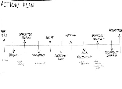
Action Plan

I have created this action plan to help me stay on track with my planning and make sure I don't miss any important parts from the pre-production. I went through all the documentation I need in order to produce a short clip and I put them in the order I intend to complete them. With this action plan the outcome, of my pre-production project, will be successful. 


Sunday, 11 March 2018

Pre-production: Top Tips Powtoon

In order to create the Powtoon presentation we did a pre-production case study of a SkyStorm Productions and created a top tips Powtoon. They shared a report on the pre-production elements. They also shared the planning of the video. Our task was to find the strengths and weaknesses of the SkyStorm pre-production. Using the websites my group focused on identifying the weaknesses of the pre-production and the other group identified the strengths.

We found that SkyStorm Productions wrote mostly about their strengths and didn't really want to own up to their weaknesses. The areas we looked at were the pre-production elements,  missed opportunities and the lesson learnt. Some of their strengths were:
  • They were organised so they didn't forget anything. On one of the websites there is a time-lapse video showing the set being designed.
  • They managed their budget well. It was not stated how big their budget was but they had enough money to have extra props they didn't actually use in the video. 
  • Their foundation allowed the production support to operate efficiently.
And some of their weaknesses were:
  • They spent money on props that weren't used instead of spending it on talent.
  • In the time-lapse video we noticed that they kept changing the design of the set and in the finished video the set ended up being hidden by the actors and props.
  • Their camera shots focused on the people instead of the background they spent so much time correcting.
In conclusion, SkyStorm Productions should have spent most of their budget on the talent. In the video clip at the bottom of their report a member of the cast wasn't dancing to the music and others didn't know how to act naturally in front of a camera. Another point we've learnt from their pre-production report is that storyboards are very important and can save you some time if you plan out the set design before actually setting it up on the day of filming. Also, SkyStorms Productions should have used a lot more long and wide angle shots to show off the background they spent so much time designing.